 Intro
 Full episode
 Clips
 Titles
YouTube podcast thumbnail best practices for talking-head shows
 By Matt Milne11 min read
A podcast thumbnail is not cover art. Cover art is square, made once and identifies the show in a list. A thumbnail is 16:9, made every episode and has to win a click in a feed of other thumbnails. YouTube recommends 3840 by 2160 pixels at 16:9 for video thumbnails and 1:1 for a podcast playlist, as JPG or PNG. Build each one from a face at a readable size, three or four words that add to the title, and a guest photo large enough to survive being shrunk.
On this page
Most podcast thumbnails are a smaller copy of the cover art with the episode number stuck on. That is the safest way to make an episode invisible. The cover art was designed to sit in a list of shows the listener already chose; the thumbnail has to stop a stranger scrolling past a grid of videos they did not ask for. Those are different jobs, and the first step to a thumbnail that gets clicked is to stop treating them as one asset.
This guide is specific to talking-head shows: one host, one or two guests, cameras on faces. It is the packaging chapter of our video podcast production guide, taken on its own because packaging is where most shows lose the audience they recorded for.
Cover art or thumbnail: which one does the job?
Cover art identifies the show. A thumbnail sells one episode. Everything else about them follows from that split.
| Cover art | Episode thumbnail | |
|---|---|---|
| Shape | Square, 1:1 | Widescreen, 16:9 |
| Made | Once, changed rarely | Every episode |
| Where it appears | Podcast apps, the YouTube podcast playlist, the channel | The YouTube feed, search, suggested videos, the embedded player |
| Who sees it | People who already follow the show | People who have never heard of it |
| What it carries | Show name, host, a consistent look | One face, one idea, three or four words |
| What it must survive | Being tiny beside forty other shows | Being tiny beside forty other videos, with the title underneath |
The two files are not interchangeable, and we keep them as separate deliverables on shows that publish to both YouTube and the audio apps. On a property show we edit, every recent episode folder carries two files: a 1500 by 1500 pixel episode artwork for the podcast listing and a 1920 by 1080 thumbnail for YouTube. Different canvas, different composition, different words, because a square built for a list and a rectangle built for a feed cannot be the same picture cropped.
One exception is worth knowing. On a venture show we edit, the title card that opens the episode on screen, at 1920 by 1080, is also the episode's thumbnail. There is no separate thumbnail file at all, and the square quote card for the audio apps is a third asset. That works because the title card was designed from the start to be read at feed size. If your opening card is designed that way, you have a thumbnail for free. If it is a wall of text on a gradient, you do not.
What does YouTube actually say about podcast thumbnails?
Less than most guides pretend. Two YouTube Help pages matter, and between them they set the specifications and the discovery rules. Neither says a word about faces, colours or text, so treat anyone quoting YouTube on those as quoting themselves.
On the specification side, YouTube's custom thumbnail page recommends that a thumbnail be as large as possible, with a resolution of 3840 by 2160 pixels for videos and a minimum width of 640 pixels, uploaded as an image format such as JPG or PNG. The aspect ratio to aim for is 16:9 for videos. For a podcast playlist, the page says to upload a 1:1 thumbnail instead of 16:9, which is the cover art job above. File size limits depend on where you upload from: 2 MB for video thumbnails or 10 MB for podcasts from a mobile device, and 50 MB for video, Shorts and podcast thumbnails from a desktop. The same page notes that custom thumbnails need a verified account, that they are used as the preview image in the embedded player, and that there is a daily limit on how many custom thumbnails a channel can upload.
On the discovery side, YouTube's podcast discovery tips describe how the platform understands a show: a podcast is a playlist, and the episodes are videos in that playlist. The page asks for one public podcast per show containing only full-length episodes, in the order they should be consumed, with no clips, other shows or other channels' uploads mixed in, and seasons kept together rather than split. The podcast title should be the show's name with nothing added, not even the word "podcast" unless it is part of the name. Each episode video is titled with the episode name and, optionally, the show name. And the page asks for a detailed description, because that is what new listeners find in search.
Read together, the two pages make a simple point. YouTube finds the show through the playlist, the title and the description. The thumbnail is not how the platform finds you; it is how a person decides whether to stop. So the thumbnail does not need to carry the show name, the episode number, the guest's job title and the date. The playlist and the title already do that. The thumbnail has one job left, and it is a human one.
What makes a podcast thumbnail clickable at feed size?
A face at a readable size, one idea, and words that add something the title does not. That is our view from building them, not a YouTube rule, and here is the reasoning behind each part.
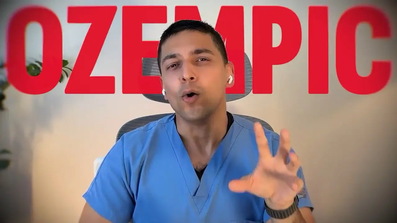
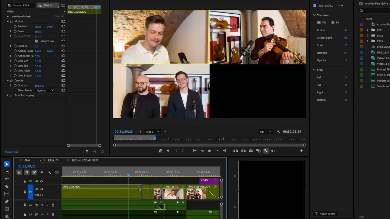
The face has to be large enough to read as an expression. A talking-head show has one real asset in the frame, which is a person reacting to something. At feed size a wide two-shot of a studio is two small blobs and a desk. Crop until the face fills a third of the frame or more, cut the person out of the background if the room is cluttered, and pick the frame where they are mid-thought rather than mid-blink. The best frame is almost never the one the export lands on; pull it from the camera file in Premiere, not from the finished episode, so you get the full-resolution image.
Three or four words, and not the title. YouTube draws the title directly under the thumbnail, so repeating it wastes the only space you have. The words on the picture should be the claim, the number or the question that the title does not state. The guest's sharpest claim on the picture, the guest's name and the topic in the title. One line, set large, in a typeface that holds up when the whole image is the width of a thumb.
Leave the logo off. On one show whose thumbnail kit we built, the show mark is absent from every thumbnail on purpose. A thumbnail competes in a grid against other thumbnails, and the channel name and the playlist already say who the show is. The logo takes space from the face and the words, and nobody clicks a logo.
Make the picture agree with the episode. This is the one that bites a serious show. On that same show, two of the five thumbnail layouts put a statistic on the picture as a flat fact. In the recording, the guest had said that some studies put the figure as high as that, which is a weaker claim, and the episode description had been written to the accurate version. A show that trades on being careful with numbers cannot have a thumbnail that overstates one, so those two layouts were flagged before anything went out. The rule for every show is the same: the thumbnail may be the sharpest version of what was said, but it may not be a version that was not said.
Judge it at the size it will be seen. Shrink the finished thumbnail until it is about the width of your thumb on a phone and look at it beside four other videos. If the words are unreadable or the face has become a dot, it has failed, whatever it looked like full-screen in Photoshop. For the show above we rendered five layouts at 1280 by 720 before the first episode, then a second set of five after the cut-outs were rebuilt.
What goes wrong on real shows?
The faults below come from our own episode folders. None of them is exotic, and all of them are avoidable with a short routine.
The guest photo arrives too small. Guests send what they have, which is usually the headshot from their company website. On a property show, one guest's picture came from their own site at 450 by 600 pixels; another episode's was 824 by 686. Neither will fill a 1920 by 1080 frame cleanly, and the temptation is to enlarge and sharpen it. We do not. A guest has to look like their own photo, and software that invents detail in a face or rewrites the small print on a book cover makes them look like somebody else. The fix is to ask for a larger original in the booking email, before the recording, and if there is none, to use the photo small, as a cut-out beside the host rather than as the whole frame.
The frame grab is useless. On a B2B marketing show, the thumbnail folder for one episode held three frame grabs at 480 by 270 pixels, and the next episode's held three at 168 by 95. A frame that small is a preview, not an export. At 168 pixels wide there is nothing to work with, and the frame has to be pulled again from the camera file. Export a frame at the sequence's full resolution, always, and name it so the next person knows it is a candidate and not the final.
The name is spelled two ways. A thumbnail that carries a guest's name or company is the most public place a spelling mistake can land, and the recording cannot be trusted for it. On one business show, the host introduced the guest's company one way on tape while every file in the project spelled it another way. On a recruitment show, the same guest was one spelling in the episode folder and a different one in the clips folder. The thumbnail, the lower third and the description must all match, and they must match the guest's own page, not the filenames and not the host's memory.
Every episode is a fresh file. In one show's archive, three consecutive episode thumbnails were three different sizes: 1408 by 752, 1376 by 768, and 2752 by 1536. Three different canvases cannot share one composition, and across a feed that reads as three unrelated shows. A template fixes it in one afternoon: a locked canvas, a fixed position for the face, a fixed type style, and only the picture and the words changing.
Versions pile up without a decision. One episode on the property show above has a "YT Thumbnail" and a "YT Thumbnail 2" sitting side by side. Two candidates are useful while choosing; two candidates in the delivery folder on publishing day mean the wrong one can be uploaded. Name the chosen one as the final and move the other out.
How should a talking-head show make its thumbnail every week?
Once, properly, then as the same short routine every episode. This is the order that works.
- Build the template before episode one. One 1920 by 1080 canvas in Photoshop, with the face zone, the word zone and the type style locked. Render five layouts, judge them at thumb size, keep one.
- Ask for the guest photo in the booking email. Say the size you need and that it will be cut out. A large original then is worth more than any amount of work later.
- Pull the frame from the camera file. Scrub the guest's own camera in Premiere for the moment the expression carries the episode, and export it at full resolution. Never from the finished export, never from a preview player.
- Write the words last, from the cut. The three or four words come from something the guest actually said, sharpened but not changed. Check them against the description so the two agree.
- Check the spelling against the guest's own page. Name, company, title. The same spelling then goes into the lower third and the description.
- Look at it beside the title. The thumbnail and the title are read together. If the words on the picture repeat the title, change one of them.
- Upload a 16:9 JPG or PNG under the size limit, and keep the square for the podcast listing separate. Two files, two jobs.
If you would rather hand this to someone, a thumbnail is one of the items on our configurator at £40 per episode, made alongside the edit by the same small team that cut it, which matters because the person choosing the frame has already watched the footage. It sits alongside the full edit, clips, intros and titles, billed per four-week cycle with no minimum term, revisions until you are happy, and every file yours.
Where to start
Open your channel on a phone and look at your last six thumbnails as a stranger would, beside the videos YouTube put next to them. If they are the cover art with a number on it, build the template this week and remake the most recent episode's thumbnail first, because that is the one still earning clicks. Then make the booking email ask for a proper photo, and the rest of the routine takes care of itself.
For the whole chain from recording to publish, the video podcast production guide covers what sits before and after this step. If you want the thumbnail made alongside the edit, spec the episode on the configurator.
Once it's recorded, you can see what goes into our full episode edit and what we charge for it.